Edgar Cervantes / Android Authority
TL;DR
- A former Google Maps designer has expressed her opinion on the latest color changes implemented in the app and has also proposed several other improvements to make it simpler.
- According to her, Maps now looks “colder, less accurate, and less human.”
- She feels Google can remove many unnecessary elements cluttering the app’s interface.
Google recently updated Maps with new colors and the changes haven’t gone down well with users. Former Google Maps designer Elizabeth Laraki has also voiced her dissent about the new Google Maps color palette, but that’s not all. She has pointed out several other things that she feels are wrong with Maps right now.
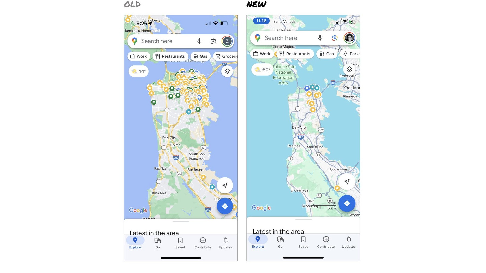
“Last week, the team dramatically changed the map’s visual design. I don’t love it. It feels colder, less accurate, and less human. But more importantly, they missed a key opportunity to simplify and scale,” Laraki reflected on X (formerly Twitter).

Elizabeth Laraki/X
She last worked on the earliest version of Google Maps 15 years ago. According to her current work profile, she has led design teams and shaped multiple core products at Facebook, Google, and YouTube.
Laraki not only finds the new colors in Google Maps “colder” and “more computer generated,” but she also feels Google should have “cleaned up the crud overlaying the map.”
“Currently, there are 11 different elements obscuring it (Maps) — Search box, eight pills overlayed in four rows, a peeking card for latest in the area, and a bottom nav bar.”
Laraki feels there’s an information overload on Google Maps and that it could be much more helpful if Google removed some of these elements or hid them elsewhere in the app.
“The map should be sacred real estate. Only things that are highly useful to many people should obscure it,” she said. You can look at the current state of Google Maps and her proposed new look in the images above.
Laraki’s modified version of Google Maps keeps the search box and bottom bar and removes everything else from the map.
She suggests, “The search box and directions are top priority and should remain prominent. My Location and map layers (satellite, traffic, etc.) could move to the bottom bar. The Explore overlays (restaurants, gas, etc.) could live in the bottom bar in Explore and open as cards. The additional space in the bottom bar could be used for Saved, as a More option, or could be removed entirely.”
Is Google Maps too cluttered? Should Google simplify its UI?
807 votes
Do you agree with Laraki’s proposed improvements for Google Maps? Do you also feel it’s too cluttered and could be dramatically simplified? Take our poll above and let us know your thoughts in the comments section.
https://ift.tt/PMQ5HRZ
Technology

No comments:
Post a Comment