Does anybody care about Android 14?
This year's release of the world's most popular operating system feels like one of the smallest ever, bringing just a handful of new features. Even during the Android portion of Google's big I/O keynote, Google spent most of its time showing off a new generative AI feature that creates wallpapers for you, as if there aren't enough wallpapers in the world.
Last year's Android 13 release felt small, but that was because it was the second major Android OS release that year. Android 12L—the big tablet and foldable release—came out earlier. What's Android 14's excuse? We're not really sure. We still have a few things to go over, though, like new lock screen customizations, genuinely exciting changes to the way the back button works, and a pile of under-the-hood changes.
The new logo
-
The new Android logo.Google
 The old, flat logo.
 It comes in a variety of colors and styles.Google
 A combined wordmark of "Google Android" is included in Google's logo animations, which would certainly be a change.Google
First up is a new logo! Android's last big rebranding happened with Android 10, and just a few years later, it's time for a new coat of paint. The wordmark is now capitalized, and the little Android "bugdroid" mascot, usually a disembodied head next to the Android wordmark, is getting its body back. The bugdroid is now fully rendered in 3D, and in keeping with Google's Material Design guidelines, it comes in a variety of colors and styles. If you ask me, bugdroid in 3D looks a bit pudgy.
In the videos on Google's redesign blog post, a "Google Android" logo occupies the screen for a good amount of time. I have never seen these two brands together as a single wordmark, and widespread usage of it would certainly be a change. Some people confuse the Android brand with the "Android Open Source Project" and think it's some kind of free-to-use logo, but Android is a trademark of Google, and you can't use it unless you license the Google Play apps. So "Google Android" is totally appropriate.
I've never actually seen the Android logo anywhere in the world outside of tech news, so I'm not sure who this is for. Even if you get a Pixel phone, you won't see the Android logo on the box or in the software. The one spot to catch it in the real world is in a tiny "powered by Android" message on the rarely seen phone boot screen. It's like a branding system exclusively for Google blog posts and trade shows.
The (somewhat) customizable lock screen
 Long press on the lock screen and you'll get this "customize lock screen" button.Ron Amadeo
 All the clock fonts.Ron Amadeo
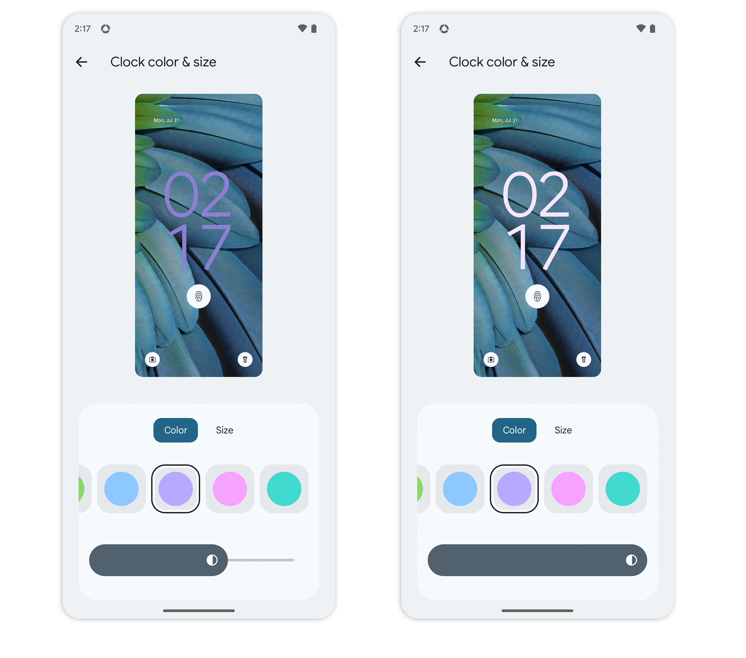 Clock color options. The slider lets you pick from dark, light, or vibrant colors.Ron Amadeo
 The shortcut screen and all nine options.Ron Amadeo
iOS 16's headline feature was its new lock screen widgets, and it seems Android wants in on the action, too. Android originally had lock screen widgets back in 2012 with Android 4.2, but they were removed just a few years later in version 5.0. Lock screen widgets are still not back in Android 14, but because Google tries to keep pace with iOS, widgets are probably a lock to appear in Android 15 or 16.
What we have in Android 14's lock screen is a selectable clock style and two shortcuts you can pick from. You can long-press on the lock screen, and a "customize" button will pop up, letting you pick from seven different clock styles. You can choose the clock's color, and a color slider lets you adjust things further. "Contrast" isn't the right word for the slider, but the left side is a lightly tinted almost-black, the right side is a lightly tinted almost-white, and a full, rich color is in the middle somewhere. There's also a "size" setting for the clock, which determines if it kicks into full-screen mode when you have no notifications or just stays small all the time.
You can assign functions to two left and right shortcuts, but the options are strangely limited. You can assign a button to the camera, a do-not-disturb toggle, the flashlight, the Google Home app, Mute, the QR code scanner, the video camera, or Google Wallet. That's it—a weird grab bag of some quick settings toggles and one or two Google apps.
Still, it's great to get an actual settings UI for the lock screen shortcuts. Previously, controlling these shortcuts meant ticking one or two on/off switches in the display settings, which is not great for something that could have multiple options. It should just be all your apps and quick settings buttons—thanks to themed icons, there should be appropriate one-color options for all of these now. Between this shortcut setting, the quick settings "edit" UI, and the app drawer/home screen, that's three "shortcut" UIs where you pick a selection of items from a big bucket of icons. Google should just pick one UI and roll with it everywhere.
In general, though, the lock screen options feel like a precursor to something more robust, with app-supplied widgets.
Article From & Read More ( Android 14 review: There's always next year - Ars Technica )https://ift.tt/Ym9bCLn
Technology


No comments:
Post a Comment